Over at Medium, Jon Moore recently identified “non-rectangular headers” as a tiny trend. A la: it’s not crazy popular yet, but just you wait, kiddo.
We’re talking about headers (or, more generally, any container element) that have a non-rectangular shape.
Such as trapezoids:

Or more complex geometric shapes:


Or rounded/elliptical:

Or even butt-cheek shaped:

My money is on these gaining popularity too. So let’s beat the crowd, and talk about a few ways of coding these up. Because let’s face it: they do look pretty awesome.
Image
Perhaps the simplest way to create any of the non-rectangular headers pictured above is to slap an image on top of your header.
But there are a few issues here:
- Responsive behavior? These masks tend to be full-width, and it becomes tedious to define multiple widths of the shape (e.g. srcset) or risk pixelation of raster assets.
- It’s a totally separate file that needs to be fetched from the server – seems wasteful for simple shapes.
- It’s slow to iterate in-browser if you have to re-export an image file(s) from your design program.
We can solve all of these problems at once. You might already know where this one is going.
SVG
Compared to exporting a JPG from Sketch, using an inline SVG is more performant, easy to make responsive, and easy to iterate the design of. In fact, for most cases, this is the way I’d recommend using. Versatile, cross-browser, vector, and fabulous.
With an angled background one like, one choice you have to make is: what should remain constant as the screen-width changes, the angle or the height differential between the two sides?
If you want the angle to remain constant, set the height of the SVG in vw:

If you want the height differential to remain constant, set the height of the SVG in pixels:

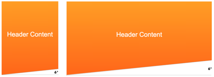
And you need not pick just one – we can style this responsively, since SVG elements are subject to media queries. Check out this geometric style header at widths below and above 700px.
Shoot, son. What’s not to love? Oh, and we can even do the butt-cheeks style.
(Perhaps that’s more properly done with beziers, but you get the idea!)
One more thing worth nothing, and that is if you want to do an SVG background entirely in CSS, you could save the SVG and reference its URL in a pseudo element.
header::after {
  content: "";
  position: absolute;
  bottom: 0;
  width: 100%;
  height: 100px;
  background: url(divider.svg);
}
And if you use `divider.svg` as a repeating element in different scenarios, you can also color it different as you need:
header::after polygon {
  fill: white;
}
But here’s an issue: what if the section below the header has a complicated background? In all these examples so far, we’ve just assumed a plain white background. What if there’s a fancy gradient, or another background image or something? Then what?
clip-path
This property comes to the rescue if you have a moderately complex background below the header, and therefore want the masking to be done from within the non-rectangular header, as opposed to by an element after it.
And like the similar SVG syntax, if you want to change the responsive behavior of the above from angle-is-held-constant to height-differential-is-held-constant, you can change the calculated height to a simple percentage.
Clip-path’s biggest downside? Browser support is not that great. However, depending on how important your non-rectangular header or div is, it might qualify as a progressive enhancement. In which case, clip-path away!
border-radius
Now, up to now, we’ve only mentioned methods that work for generating all the shapes I called out above. However, if we know what particular shape we want our header to have, we might have access to an easier way.
For instance, a convex elliptical header is a perfect fit for border-radius.
And a concave elliptical header could simply have the border-radius on the element after the header.
section {
  border-bottom-left-radius: 50% 20%;
  border-bottom-right-radius: 50% 20%;
}
Another benefit to this method is that the background of the section below the header could still have background images.
transform: skew
If we know that we want to create do a trapezoidal header, we can use a CSS transform to skew the whole thing.
This has the side effect of skewing any child elements of the skewed element, so you’ll want to add a child element in the header that gets skewed, and everything else will go in sibling elements.


Stripe’s homepage design uses this method, and even more brilliantly, they include a few children spans (each is a block of color) that get skewed with the parent element, creating a more complex and colorful effect.
Which is best?
As far as I’m concerned, SVG is generally the way to go. However, if you have a more complex background below the header, then the best choice depends on the shape. In that case, I’d investigate if skew or border-radius could meet the art direction needed, or if browser support was enough of a non-issue to go with clip-path.
| Allows complex BG below | Browser support | Shapes creatable | |
|---|---|---|---|
| Image | No | Yes | All |
| SVG | No | Yes | All |
| Clip-path | Yes | No | All |
| Border-radius | Yes | Yes | Elliptical only |
| Transform: skew | Yes | Yes | Trapezoidal only |


