When we start learning CSS, we find that CSS units of measurement are categorized as relative or absolute. Absolute units are rooted in physical units, such as pixels, centimeters, and inches. But over the years, all absolute units in CSS have lost their connection to the physical world and have become different kinds of relative units, at least from the perspective of the web.
It’s important to note that there are still significant differences between relative and absolute units. CSS relative units are sized according to other style definitions defined by parent elements or are affected by the size of a parent container. As for absolute units, we will dive in and see how they are affected by other things, such as the screen and the device’s operating system.
Relative units include units such as %, em, rem, viewport units (vw and vh), and more. The most common absolute unit is the pixel (px). Besides that, we have the centimeter unit (cm) and the inches unit (in).
Now, let’s explore why CSS absolute units aren’t so absolute.
CSS Pixels
Pixels have been the most common unit of CSS, dating to the beginning of the web. In the old world of desktop screens, before we had any smartphones, the screen’s pixels were always equivalent to CSS pixels.
In 2007, for example, the most common desktop resolution was 1024×768 pixels. Back then, we would normally give our web pages a fixed width of 1000 pixels to fit the entire page, and the leftover pixels would be saved for the browser’s scrollbar.

SMARTPHONE SCREENS
Smartphones brought another quiet evolution, starting the era of high-density screens. If we consider an iPhone 12 Pro, whose screen is 1170 pixels wide, we would count every 3 pixels on the device as 1 pixel in the CSS.

When we size in mobile, we measure according to CSS pixels, not according to device pixels. To sum up:
- CSS pixel are logical pixels.
- Device pixels are real physical pixels.

Okay, but what about desktop devices? Do they still work with the same old pixel calculation? Let’s talk about that.
DESKTOP SCREENS IN 2021
High-density screens came to laptops several years later. The 2014 MacBooks got the first “retina” screens (retina being synonymous with high density).
These days, most laptops have a high-density screen.
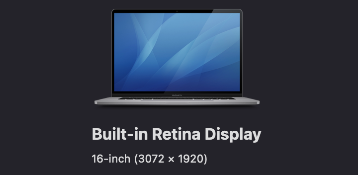
Let’s consider MacBooks:
- The 13.3-inch MacBook Pro has a screen that is
2560pixels wide but that behaves like1440pixels. This means that every1.778physical pixels act like1logical pixel. - The 16-inch MacBook Pro has a screen that is
3072pixels wide but that behaves like1792pixels. This means that every1.714physical pixels act like1logical pixel.
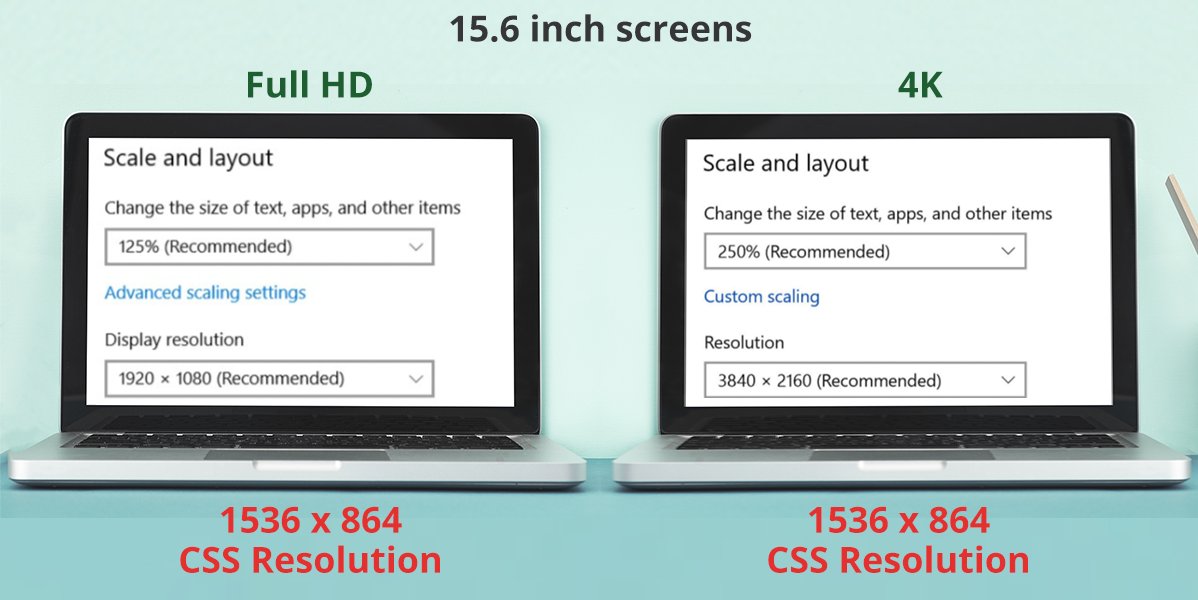
Among PC laptops, I tested two 15.6-inch screens, one with full HD resolution and the other with 4K resolution. The results were interesting:
- The 15.6-inch full-HD screen is
1920pixels wide but behaves like1536pixels. This means that every1.25physical pixels act like1logical pixel. - The 15.6-inch 4K screen is
3840pixels wide but behaves, again, like1536pixels. This means that every2.5physical pixels act like1logical pixel.
As you can see, the connection between the real physical (i.e. device) pixels and the CSS (i.e. logical) pixels has almost vanished.
SCREENS HAVE BECOME DENSER OVER THE YEARS
In the past, if you looked closely at a screen, you could actually see its pixels. When the technology of screens improved, manufacturers started to create higher-density screens.
Recommended reading: What Does A Foldable Web Actually Mean?
WHY DO WE CALCULATE LOGICAL PIXELS DIFFERENTLY?
Over the years, as screens became denser, we couldn’t fit more content in the same screen size merely because the screen has more pixels.
Think about it for a moment. Consider the Samsung Galaxy S21 Ultra. Its narrower dimension is 1440 physical pixels. We could easily fit it in a regular desktop screen. But if we did, the text would be small to the point of being unreadable. Because of this, we separate physical pixels from logical pixels.
Sizes in CSS (i.e. width and height), then, are calculated according to CSS logical pixels. Of course, we can use physical pixels to load high-density content, such as images and videos, like so:
<img src="image-size-1200px.jpg" width="300" >
OK, CSS pixels aren’t equal to a device’s physical pixels. But we have centimeters and inches. Those are physical units connected to the physical world, right? Let’s check them out.
CSS Inches And CSS Centimeters
Wherever we use physical units like inches and centimeters, we know these are absolute units.
I had a thought that if CSS pixels aren’t equal to device pixels, then maybe it would be a good idea to use physical units such as inches and centimeters on the web. They are absolute units, right?
To be sure, I tested it. I created a box with a width and height of 1 centimeter and gave it a background color of red. I grabbed a real tape measure and got a surprise:
A CSS centimeter isn’t equal to a physical centimeter.
Here I am testing a CSS centimeter unit with a tape measure on a mid-2019 13-inch MacBook:

The result is the same for CSS inches:
A CSS inch isn’t equal to a physical inch.
The same holds true for pica (pc) and millimeter (mm) units. These correspond to a part of either a CSS inch or a CSS centimeter, neither of which is connected to a real inch or a real centimeter.
WHY CSS INCHES AND CENTIMETERS AREN’T REAL INCHES AND CENTIMETERS
Since the 1980s, the PC market has determined a CSS inch to be equivalent to 96 pixels. This calculation of pixels was directly tied to the DPI/PPI (pixels per inch) standard of Microsoft’s Windows operating system for monitors at the time, the most common of which had a standard of 96 DPI.
This meant that 1 CSS inch would always be equivalent to 96 CSS pixels.
As for CSS centimeters, every centimeter is directly calculated from inches, which means that 1 inch is equivalent to 2.54 centimeters. This means that every 1 CSS centimeter will always be equal to 37.7952756 CSS pixels.
In other words: 1cm = 37.7952756px (96px / 2.54).
See the Pen [CSS Real Dimensions!](https://codepen.io/smashingmag/pen/BaRJvWj) by Elad Shechter.
That decision, which seemed like a good idea at the beginning of the PC industry (which had kind of one standard), turned out to be a poor decision that would make the CSS inch and centimeter obsolete and useless (at least from the perspective of the web).
Note that in the 1980s, Apple had a different standard of 72 DPI for screens.
SCREEN PIXELS GET DENSER
As I mentioned, the DPI of screens got denser over the years, and we saw screens of 120 to 160 DPI. And because 1 CSS inch always equals 96 CSS pixels, it means now that a CSS inch isn’t equal to a real physical inch.

Because a CSS inch and a CSS centimeter are directly converted from CSS pixels, and because screens have gotten more DPIs over the years, we’ve gotten to the point where these units don’t represent what they’re supposed to represent on screens.
CSS Point Unit
The point (pt) unit is one of the less-recognized units of CSS. As Wikipedia states:
“In typography, the point is the smallest unit of measure. It is used for measuring font size, leading, and other items on a printed page.”
The Wikipedia page shows a ruler with the point scale on the bottom and the inch scale on the top:

Before we get into why this unit isn’t really an absolute unit for the web, let’s go over the basic units of screens and printers.
PPI AND DPI
We’ve already mentioned DPI, and you might have heard those terms in the past, but if you’ve never understood what exactly they’re all about, here is quick primer:
- PPI
Screens are built from a lot of small light dots, called pixels. To measure the density of pixels, we count the number of pixels that fit 1 inch, called pixels per inch (PPI). - DPI
Printers print color dots. To represent the density of printer dots, we count the number of dots that fit 1 inch of paper, called dots per inch (DPI).
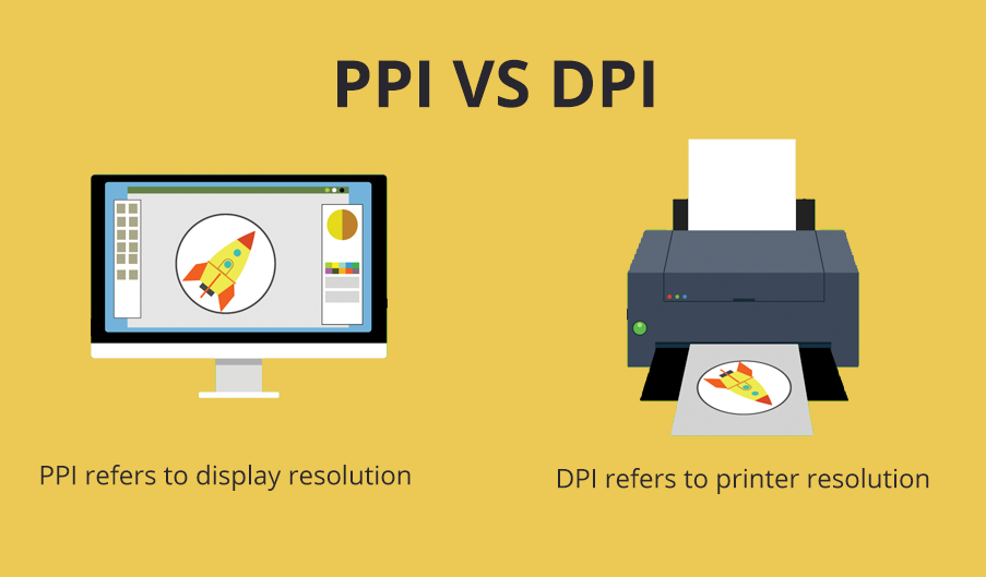
In short, these are two ways to measure the density of visual information that we can fit in 1 inch.
- PPI: pixels per inch (for screens)
- DPI: dots per inch (for printers)
It is important to mention that the count of CSS pixels and dots in 1 inch are for both the width and the height. This means that on a screen of 96 PPI, a box with a height and width of 1 inch will have a total size of 9216 pixels (96×96 px = 9216 px).
Here is a visual demonstration of 1 inch with a screen of 10 PPI:

Here are some examples of real calculations of CSS PPI:
| CSS Resolution (Pixels) |
CSS PPI | CSS Inches (width and height) |
|---|---|---|
| 96x96 | 96 | 1×1 |
| 141×141 | 141 | 1×1 |
“DPI” FOR SCREENS
Manufacturers of mobile and desktop devices prefer to express their screen measurements in DPI, not PPI. But don’t let that confuse you: It is always PPI for screens and DPI for printers.
DPI/PPI STANDARDS
To represent all those dots and pixels, we have the point (pt) unit.
But the point unit of CSS derives from the default printer DPI, which, again, was decided in the 1980s and is equal to 72 DPI. This means that 1 inch of CSS always equals 72 points.
1inch =72points1point =1/72nd of1inch
PIXELS FOR WEB, DOTS FOR PRINTERS
For the web, the DPI unit has no meaning. The web DPI is defined according to a different standard (96 DPI), which we already talked about when we calculated a CSS inch and CSS centimeter. Because of this, there is no reason to use the point unit on the web.
Note: 1 point isn’t equal to (CSS) pixels.
1point =1.333pixels72points =1inch72points =96pixels
Printers
In this article, I mainly wanted to demonstrate why there aren’t any absolute units for the web. But what about using them for printers? Is there a reason to use CSS inches or centimeters or point units for printers?
MY PRINTING TEST
I ran a small test to check whether the 1980s standard of DPI works correctly on printers. I created two boxes: one with a width and height of 72 points, and the second one with a width and height of 1 inch.
I printed these two boxes on a laser printer that I have in my office. Here is my Codepen for testing points and inches for printers:
See the Pen [1 inch](https://codepen.io/smashingmag/pen/ZEKxMMy) by Elad Shechter.
RESULT
I printed this demo on a laser printer. To my surprise, if I use 72 points (or 1 inch), I get exactly 1 inch. This means that, for printers, there is still, maybe, a good reason to use CSS units such as points, inches, and centimeters.

Printers are able to print more DPIs, but if we are working at 100% zoom on the printer, then 72 points (or 1 inch) of CSS will equal a real physical inch.
Reminder: This article is more about the connection of absolute units to the web rather than to printers. Of course, the results might change on different types of printers.
Recommended reading: Using HSL Colors In CSS
Trying To Create Accurate Sizes On The Web
If we look at the 16-inch MacBook Pro, which has a ratio of 1.714 physical pixels to every 1 CSS pixel, we can’t accurately predict sizes on the web.
If we try to guess the real device pixel ratio on the 16-inch MacBook Pro using JavaScript’s window.devicePixelRatio, it will return an incorrect ratio of 2, instead of 1.714. (And this is without taking into account the zoom state of the web browser and operating system.)

Why We Need Real Absolute CSS Units
When we want to define a fixed size for a sidebar element, we would use CSS pixels. But if you think about it, CSS pixels have no meaning these days. As we saw above, on most smartphones and desktops, CSS pixels don’t describe device pixels anymore.
Based on this, I believe we need actual physical units for CSS (like a real centimeter or inch unit) because CSS pixels no longer have any true meaning on the web.
It’s worth mentioning that Firefox had implemented an actual physical millimeter unit (mozmm), but removed it in version 59. I don’t know why they removed it. Perhaps it’s because so many things already depend on CSS pixels, such as responsive images and the em and rem units. If we tried to add a new physical measurement, maybe it would cause more problems than it solves.
It seems that web folk have gotten so used to thinking in pixels that, even though the CSS pixel unit has lost its connection to device pixels, we’ll keep using the unit.
And in case you still think that CSS pixels are an excellent unit of measurement, try to explain to a new web developer what this unit is actually measuring.
For now, we don’t have any real way to describe physical sizes in CSS.
So, the CSS pixel is the worst kind of absolute unit — except for all the others.
To Summarize
At the beginning of this article, I said that the absolute CSS units have become like new kinds of relative units. We started with CSS pixels, and we saw the difference between CSS pixels and device pixels.
Then, we found that CSS inches and CSS centimeters are directly converted from CSS pixels and aren’t connected to real inches and centimeters. In the end, we talked about the point unit and, again, about how this unit has no absolute meaning for the web.
FINAL WORDS
That’s all. I hope you’ve enjoyed this article and learned from my experience. If you like this post, I would appreciate hearing about it and sharing it.
REFERENCES
- “CSS Length Explained”, Tim Chien, Robert Nyman, Mozilla Hacks
- “Dots Per Inch”, Wikipedia
- “Point (Typography)”, Wikipedia
- “CSS Values and Units”, W3C