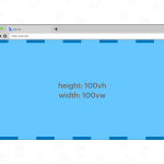
1.vw/vh:就是相对视口宽度或者高度,100vw 等于整个屏幕宽度 100vh等于整个屏幕高度。1vw = 1% * 视口宽度。意思是一个视口就是100vw。长度和宽度等于窗口长度或宽度的1/100
例如:1920x800的设计稿
换算1/1001920=19.2 所以 1vw=19.2px; 即:1vw/y=100vw/1920px
换算1/100800=8 所以 1vh=8px;
2.px:px是屏幕设备物理上能显示出的最小的一点。是相对长度单位。在桌面浏览器中,1个像素往往是对着电脑屏幕的1个物理像素,但是在移动端,css中的1px并不等于设备的1px。比如iphone3,分辨率是320 x 480。iphone4变成了640 x 960,但是iphone4的实际屏幕尺寸并没有变化。这时候的1个css像素就是等于两个物理像素。
3.rem:相对于html根元素的字体大小(font-size)来计算的长度单位,可以设置,默认16px
4.em:所有现代浏览器下,默认字体尺寸都是16px。这时,1em = 16px。em会继承父级尺寸,也是相对单位。
二、vw px rem之间的换算
1.我们假设psd的设计稿是以1920px为标准的。那么:
100vw = 1920px => 1vw = 19.2px
假设: 1rem = 100px
那么:
1920px=19.2rem = 100vw => 1rem = 100/19.2 =5.208vw
100px = 1rem = 5.208vw
这时候,我们只要给html的根元素设置:
font-size: 5.208vw即可。
//如果屏幕宽度小于375像素(max-device-width: 375px)就加载tiny.css文件。
//写法1
 <link rel="stylesheet" type="text/css"
     media="screen and (max-device-width: 375px)"
     href="tiny.css" />
//写法2
@import  url("tiny.css") screen and (max-device-width: 375px);
//写法3
@media  screen and (max-device-width: 375px) {
    .column {}
   }
响应式布局:
一:使用百分比与rem
宽度% 高度rem 字号rem 在html中设置根元素的font-size大小
html{
  font-size:16px;
}
//1.媒体查询
html{font-size:10px}
@media screen and (min-width:321px) and (max-width:375px){html{font-size:11px}}
@media screen and (min-width:376px) and (max-width:414px){html{font-size:12px}}
@media screen and (min-width:415px) and (max-width:639px){html{font-size:15px}}
@media screen and (min-width:640px) and (max-width:719px){html{font-size:20px}}
@media screen and (min-width:720px) and (max-width:749px){html{font-size:22.5px}}
@media screen and (min-width:750px) and (max-width:799px){html{font-size:23.5px}}
@media screen and (min-width:800px){html{font-size:25px}}
//2.借助sass,less等,类似这种

@baseFontSize: 75;//基于视觉稿横屏尺寸得出的基准值font-size
/*rem = document.documentElement.clientWidth * dpr / 10
设备像素比(device pixel ratio) = 物理像素 / 设备独立像素
dpr=window.devicePixelRatio
以iphone6为例:
设备宽高为375×667,可以理解为设备独立像素(或css像素)。
dpr为2,根据上面的计算公式,其物理像素就应该×2,为750×1334。不同设备,dpr不同
*/
.px2rem(@px){
    @return @px / @baseFontSize * 1rem;
}
//使用示例:
.container {
    height: px2rem(240);
}
//less翻译结果:
.container {
    height: 3.2rem;
}
//同时也要借助js动态设置html的font-size

let deviceWidth = document.documentElement.clientWidth;
document.documentElement.style.fontSize = deviceWidth / 7.5 + 'px';

window.onresize = function(){
   let deviceWidth = document.documentElement.clientWidth;
   document.documentElement.style.fontSize = deviceWidth / 7.5 + 'px';
};

3.vw视口
//此时设计稿大小为750px,用/100的方式可以很容易进行rem的换算,几乎不
//需要借助其他工具,直接设计稿大小除以100即可,并不觉得麻烦,所以一直在用
html{
    font-size: calc(100vw / 7.5);
}
let deviceWidth = document.documentElement.clientWidth;
document.documentElement.style.fontSize = deviceWidth / 7.5 + 'px';

window.onresize = function(){
   let deviceWidth = document.documentElement.clientWidth;
   document.documentElement.style.fontSize = deviceWidth / 7.5 + 'px';
};
4.使用插件
postcss-pxtorem:转换px为rem的插件
安装 postcss-pxtorem
npm install postcss-pxtorem --save
这样页面中的rem将根据根元素显示字号大小,2rem就是32px
二:使用百分比与px
单位设置px,移动端的px自动转为rem
// 自动计算 1080p 为 vw
@function vw($px, $isFontSize: 0) {
  @if $isFontSize == 1 {
    @return $px * 1px;
  }
  @return $px / 1920 * 100vw;
}

// 自动计算 750 屏幕的 rem
@function rem($px) {
  @return ($px / 32) * 1rem;
}


rem、rm、px、vw之间的相互转换